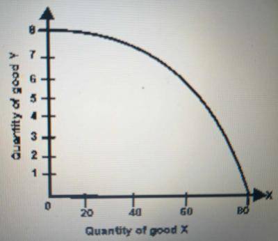
The diagram below represent
ECONOMICS
JAMB 2023
The diagram below represent
- A. Supply curve
- B. Production possibility curve
- C. indifference curve
- D. Demand curve
Correct Answer: B. Production possibility curve
Explanation
The digram above represent the production possibility curve which is also known as production possibility frontier, production possibility boundary, or transformation curve.
Post an Explanation Or Report an Error
If you see any wrong question or answer, please leave a comment below and we'll take a look. If you doubt why the selected answer is correct or need additional more details? Please drop a comment or Contact us directly. Your email address will not be published. Required fields are marked *