The graph below represents _______
ECONOMICS
JAMB 2017
The graph below represents _______
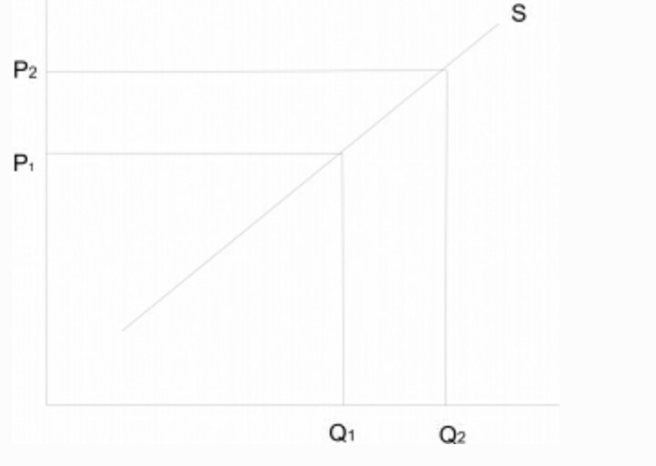
- A. a decrease in quantity supplied
- B. an increase in supply
- C. a decrease in supply
- D. an increase in quantity supplied
Correct Answer: D. an increase in quantity supplied
Explanation
There is an increase in the quantity supplied if the quantity supplied increases as a result of an increase in price of the commodity. From the graph, an increase in the price of the commodity from p1 to p2 brought about a corresponding increase in quantity supplied from q1 to q2.
Post an Explanation Or Report an Error
If you see any wrong question or answer, please leave a comment below and we'll take a look. If you doubt why the selected answer is correct or need additional more details? Please drop a comment or Contact us directly. Your email address will not be published. Required fields are marked *